
Practical Guide to Graphite Monitoring
Engineers love to improve things. Refactoring and optimizations drive us. There is just a slight problem: we often do that in a vacuum.
Before optimizing, we need to measure.
Without a solid baseline, how can you say that the time you invested in making things better wasn’t a total waste?
True refactoring is done with a solid test suite in place. Developers know that their code behavior didn’t change while they cleaned things up. Performance optimization is the same thing: we need a good set of metrics before changing anything.
There are plenty of monitoring tools out there, each with its own pros and cons. The point of this article isn’t to argue about which one you should use, but instead to give you the some practical knowledge about Graphite.
Graphite is used to store and render time-series data. In other words, you collect metrics and Graphite allows you to create pretty graphs easily.
During my time at LivingSocial, I relied on Graphite to understand trends, issues and optimize performance. As my coworkers and I were discussing my recently announced departure, I asked them how I could help them during the transition period. Someone mentioned creating a Graphite cheatsheet. The cheatsheet turned into something much bigger than I expected and LivingSocial was nice enough to let me publicly publish this short guide.
For a more in depth dive into the statsd/graphite features, look at this blog post
Organizing metrics
There are many ways to feed Graphite, I personally used Etsy’s statsd (node.js daemon) which was being fed via the statsd RubyGem. The gem allows developers to push recorded metrics to a statsd server via UDP. Using UDP instead of TCP makes the metrics collection operation non blocking which means that while you might theoretically lose a few samples, your instrumented code performance shouldn’t be affected. (Read Etsy’s blog post to know more about why they chose UDP).
** Tip **: Doing DNS resolution on each call can be a bit expensive (a few ms), target your statsd server using its ip or use Ruby’s resolv standard library to only do the lookup once at initialization.
Note: I’m skipping the config settings about storage retention, resolution etc.. see the manual for more info.
Namespacing
Always namespace your collected data, even if you only have one app for now. If your app does two things at the same time like serving HTML and providing an API, you might want to create two clients which you would namespace differently.
Naming metrics
Properly naming your metrics is critical to avoid conflicts, confusing data and potentially wrong interpretation later on. I like to organize metrics using the following schema:
<namespace>.<instrumented section>.<target (noun)>.<action (past tense verb)>
Example:
accounts.authentication.password.attempted
accounts.authentication.password.succeeded
accounts.authentication.password.failed
I use nouns to define the target and past tense verbs to define the action. This becomes a useful convention when you need to nest metrics. In the above example, let’s say I want to monitor the reasons for the failed password authentications. Here is how I would organize the extra stats:
accounts.authentication.password.failure.no_email_found
accounts.authentication.password.failure.password_check_failed
accounts.authentication.password.failure.password_reset_required
As you can see, I used failure instead of failed in the stat name.
The main reason is to avoid conflicting data. failed is an action and
already has a data series allocated, if I were to add nested data using
failed, the data would be collected but the result would be confusing.
The other reason is because when we will graph the data, we will often
want to use a wildcard * to collect all nested data in a series.
Graphite wild card usage example on counters:
accounts.authentication.password.failure.*
This should give us the same value as accounts.authentication.password.failed,
so really, we should just collect the more detailed version and get rid
of accounts.authentication.password.failed.
Following this naming convention should really help your data stay clean and easy to manage.
Counters and metrics
StatsD lets you record different types of metrics as illustrated here.
This article will focus on the 2 main types:
- counters
- timers
Use counters for metrics when you don’t care about how long the code your are instrumenting takes to run. Usually counters are used for data that have more of a direct business value. Examples include sales, authentication, signups, etc.
Timers are more powerful because they can be used to analyze the time spent in a piece of code but also be used as a counters. Most of my work involves timers because I want to detect system anomalies including performance changes and trends in the way code is being used.
I usually use timers in a nested manner, starting when a request comes into the system, through each of the various datastores, and ending with the response.
Monitoring response time
It’s a well known fact that the response time of your application will both affect the user’s emotional experience and their likelihood of completing a transactin. However understanding where time is being spent within a request is hard, especially when the problems aren’t obvious. Tools like NewRelic will often get you a good overview of how your system behave but they also lack the granularity you might need. For instance NewRelic aggregates and averageses the data client side before sending it to their servers. While this is fine in a lot of cases, if you care about more than averages and want more detailed metrics, you probably need to run your own solution such as statsd + graphite.
I build most of my web-based APIs on wd_sinatra which
has a pre_dispatch_hook method which method is executed before a
request is dispatched.
I use this hook to both set the “Stats context” in the current thread and extract the client name based on HTTP headers. If you don’t use WD, I’ll show how to do the same thing in a Rack middleware.
def pre_dispatch_hook
  api_client = extract_api_client_name(env)
  Thread.current[:stats_context] = "#{api_client}.http.#{env['wd.service'].verb}.#{env['wd.service'].url}".gsub('/', '.')
  # [...]
end
Then using Sinatra’s global before/after filters, we set a unique request id and start a timer that we stop and report in the after filter. If we were using Rails we’d get the unique identifier generated automatically.
Before filter:
require 'securerandom'

before do
  Thread.current[:request_id] = request.env['HTTP_X_REQUEST_ID'] || SecureRandom.hex(16)
  response['X-Request-Id'] = Thread.current[:request_id]
  @instrumentation_start = Time.now
end
After filter:
after do
  stat = (Thread.current[:stats_context] || "http.skipped.#{env["REQUEST_METHOD"]}.#{request.path_info}") + ".response_time"
  $statsd.timing(stat, ((Time.now - @instrumentation_start) * 1000).round, 1) if @instrumentation_start
end
Note that this could, and probably should, be done in a Rack middleware like this (untested, YMMV):
# require whatever is needed and set statsd

class Stats
  class Middleware

    def initialize(app)
      @app = app
    end

    def call(env)
      request = Rack::Request.new(env)
      Thread.current[:request_id] = request.env['HTTP_X_REQUEST_ID'] || SecureRandom.hex(16)
      response['X-Request-Id'] = Thread.current[:request_id]
      api_client = extract_api_client_name(env)
      Thread.current[:stats_context] = "#{api_client}.http.#{request.request_method}.#{request.path_info}".gsub('/', '.')
      @instrumentation_start = Time.now

      response = @app.call(env)

      stat = (Thread.current[:stats_context] || "http.skipped.#{env["REQUEST_METHOD"]}.#{request.path_info}") + ".response_time"
      $statsd.timing(stat, ((Time.now - @instrumentation_start) * 1000).round, 1) if @instrumentation_start
      response
    end

  end
end
Note that the stats are organized slightly differently and will read like that:
<namespace>.<client name>.http.<http verb>.<path>.<segments>.response_time
The dots in the stats name will be used to create subfolders in graphite.
By using such a segmented stats name, we will be able to use *
wildcards to analyze how an old version of an API compares against a
newer one, which clients still talk to the old APIs, compare response
times, etc.
Monitor time spent within a response
We’re collecting stats on every request so we can see request counts and median average response times. But wouldn’t be better if we could measure the time spent in specific parts of our code base and compare that to the overall time spent in the request?
We could, for instance, compare the time spent in the DB vs Redis vs Memcached vs the framework. And what’s nice is that we could do that per API endpoint and per API client. In a simpler case, you might decide to monitor mobile vs desktop. The principle is the same.
Let’s hook into ActiveRecord’s query generation to track the time spent in AR within each request:
module MysqlStats
  module Instrumentation
    SQL_INSERT_DELETE_PARSER_REGEXP = /^(\w+)\s(\w+)\s\W*(\w+)/
    SQL_SELECT_REGEXP = /select .*? FROM \W*(\w+)/i
    SQL_UPDATE_REGEXP = /update \W*(\w+)/i

    # Returns the table and query type
    def self.extract_from_sql_inserts_deletes(query)
      query =~ SQL_INSERT_DELETE_PARSER_REGEXP
      [$3, $1]
    end

    def self.extract_sql_selects(query)
      query =~ SQL_SELECT_REGEXP
      [$1, 'SELECT']
    end

    def self.guess_sql_content(query)
      if query =~ SQL_UPDATE_REGEXP
        [$1, 'UPDATE']
      elsif query =~ SQL_SELECT_REGEXP
        extract_sql_selects(query)
      end
    end
  end
end

ActiveSupport::Notifications.subscribe "sql.active_record" do |name, start, finish, id, payload|
  if payload[:name] == "SQL"
    table, action = MysqlStats::Instrumentation.extract_from_sql_inserts_deletes(payload[:sql])
  elsif payload[:name] =~ /.* Load$/
    table, action = MysqlStats::Instrumentation.extract_sql_selects(payload[:sql])
  elsif !payload[:name]
    table, action = MysqlStats::Instrumentation.guess_sql_content(payload[:sql])
  end

  if table
    $statsd.timing("#{Thread.current[:stats_context] || 'wild'}.sql.#{table}.#{action}.query_time",
                        (finish - start) * 1000, 1)

  end
end
This code might not be pretty but it works (or should work).
We subscribe to ActiveSupport::Notifications for sql.active_record
and we extract the info we need. Then we use the stats context set in
the thread and report the stats by appending
.sql.#{table}.#{action}.query_time
The final stats entry could look like this:
auth_api.ios.http.post.v1.accounts.sql.users.SELECT.query_time
- auth_api: the name of the monitored app
- ios: the client name
- http: the protocol used (you might want to monitor thrift, spdy etc..
- post: HTTP verb
- v1.accounts: the converted uri: /v1/accounts
- sql: the key for the SQL metrics
- users: the table being queried
- SELECT: the SQL query type
- query_time: the kind of data being collected.
As you can see, we are getting granular data. Depending on how you setup statsd/graphite, you could have access to the following timer data for each stat (and more):
- count
- lower
- mean
- mean_5
- mean_10
- mean_90
- mean_95
- median
- sum
- upper
- upper_5
- upper_10
- upper_90
- upper_95
Instrumenting Redis is easy too:
::Redis::Client.class_eval do

  # Support older versions of Redis::Client that used the method
  # +raw_call_command+.
  call_method = ::Redis::Client.new.respond_to?(:call) ? :call : :raw_call_command

  def call_with_stats_trace(*args, &blk)
    method_name = args[0].is_a?(Array) ? args[0][0] : args[0]
    start = Time.now
    begin
      call_without_stats_trace(*args, &blk)
    ensure
      if Thread.current[:stats_context]
        $statsd.timing("#{Thread.current[:stats_context]}.redis.#{method_name.to_s.upcase}.query_time",
                         ((Time.now - start) * 1000).round, 1) rescue nil
      end
    end
  end

  alias_method :call_without_stats_trace, call_method
  alias_method call_method, :call_with_stats_trace

end if defined?(::Redis::Client)
Using Ruby’s alias method chain, we inject our instrumentation into the Redis client so we can track the time spent there.
Applying the same approach, we can instrument the Ruby memcached gem:
::Memcached.class_eval do

  def get_with_stats_trace(keys, marshal=true)
    start = Time.now
    begin
      get_without_stats_trace(keys, marshal)
    ensure
      if Thread.current[:stats_context]
        type = keys.is_a?(Array) ? "multi_get" : "get"
        $statsd.timing("#{Thread.current[:stats_context]}.memcached.#{type}.query_time",
                         ((Time.now - start) * 1000).round, 1) rescue nil
      end
    end
  end

  alias_method :get_without_stats_trace, :get
  alias_method :get, :get_with_stats_trace

end if defined?(::Memcached)
Dashboards
We now have collected and organized our stats. Let’s talk about how to use Graphite to display all this data in a valuable way.
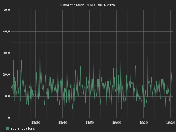
When looking at timer data series, the first thing we want to do is create an overall represention. Your first inclination is probably an average.
The problem with the mean is that it’s the sum of all data points divided by the number of data points. It can thus be significantly affected by a small number of outliers.
The median value is the number found in the center of the sorted list of collected data points. The problem in this case is that based on your data set, the median value might not well represent the real overall experience.
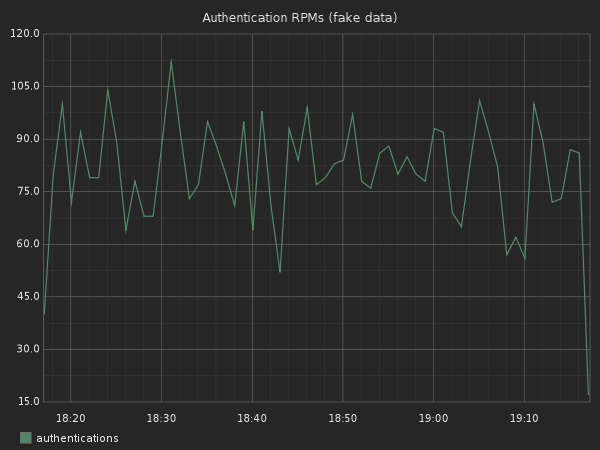
Neither median nor mean can summarize the whole story of your system’s behavior. Instead I prefer to use a 5-95 span (thanks Steve Akers for showing me this metric and most of what I know about Graphite). A 5-95 span means that we cut off the extreme outliers above 95% and below 5%.
Span
Here is a comparison showing how the graphs can be different for the same data based on what metric you use:
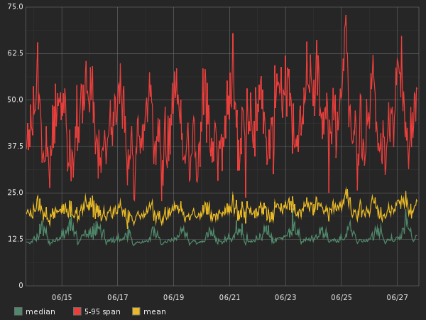
Of course the span graph looks much worse than the other two, but it’s also more representative of the real user experience and thus more valuable. Here is how you would write the graphite function to get this data.
Given that we are tracking the following data-series:
stats.timers.accounts.ios.http.post.authenticate.response_time
The function would be:
diffSeries(stats.timers.accounts.ios.http.post.authenticate.response_time.upper_95,
           stats.timers.accounts.ios.http.post.authenticate.response_time.upper_5)
Alias
If you try that function, the graph legend will show the entire function, which really doesn’t look great. To simplify things, you can use an alias like I did in the graph above:
alias(diffSeries(stats.timers.accounts.ios.http.post.authenticate.response_time.upper_95,
                 stats.timers.accounts.ios.http.post.authenticate.response_time.upper_5),
      "iOS authentication response time (span)")
Aliases are very useful, especially when you share your dashboards with others.
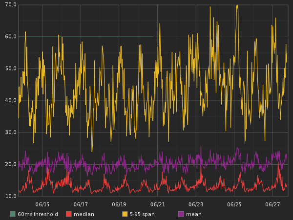
Threshold
Another neat feature you might add to your graph is a threshold. A threshold is a visual representation of expectations. Say, for example, that your web service shouldn’t be slower than 60ms server side. Let’s add a threshold for that:
alias(threshold(60), "60ms threshold")
and here’s how it would look in a graph:
Draw Null as Zero
Another useful trick is to change the render options of a
graph to draw null values as zero.
Open the graph panel, click on Render Options, then Line Mode and check
the Draw Null as Zero box.
Here is a graph tracking a webservice that isn’t getting a lot of traffic:
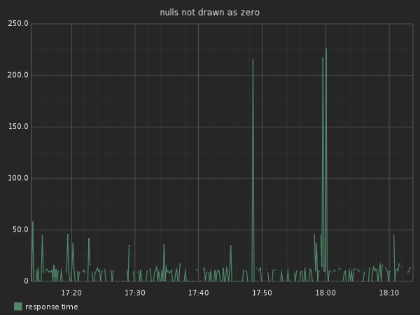
You can see that the line is discontinued, that’s because the API
doesn’t constantly receive traffic. If your data series gets only very
few entries, you might not even see a line. This is why you want to
enable the Draw Null as Zero.
SumSeries & Summarize or how to get RPMs
By default graphite shows data at a 10 second interval. But often you want to see less granular data, like the quantity of requests per second.
Let’s say we didn’t use a counter for the amount of requests, but because we used the middleware I described earlier, we are timing all responses. Graphite keeps a count of the timers we used, so we can use this count value with a wildcard:
stats.timers.accounts.*.http.post.authenticate.response_time.count
If we were to render a graph for this stat we would see a graph per
client. Right now we only care about showing the total amount of requests.
To do that, we’ll use the sumSeries function:
sumSeries(stats.timers.accounts.*.http.post.authenticate.response_time.count)
The graph looks pretty but it’s hard to understand what kind of request volume we are getting. We can summarize this data to show 1 min summaries instead:
summarize(sumSeries(stats.timers.accounts.*.http.post.authenticate.response_time.count), "1min")
We can now see the quantity of requests per minute. You could do the same to resolve by hour, day, etc.
Timeshift
Graphite has the ability to compare a given metric across two different time spans. For instance, let’s compare today’s quantity of logins vs those from last weeks.
To generate today’s graph:
alias(summarize(sumSeries(stats.timers.accounts.*.http.post.authenticate.response_time.count),"1min"), "today")
Then we use the timeShift function to get last week’s data:
alias(timeShift(summarize(sumSeries(stats.timers.accounts.*.http.post.authenticate.response_time.count), "1min"),"1w"), "last week")
Graphing both series in the same graph will give us that:
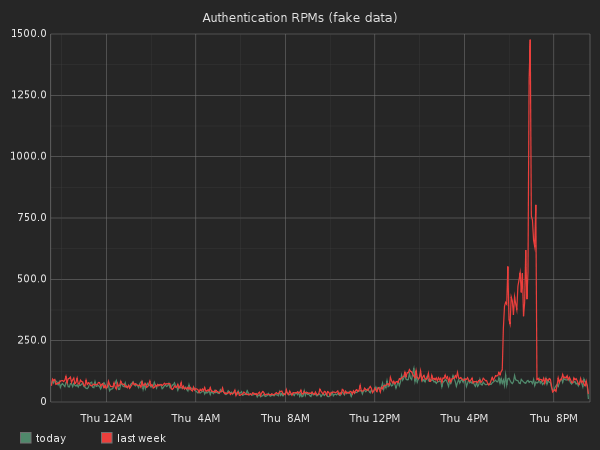
Wow, it looks like last week we had an authentication peek for a few hours. Why? It would be interesting to graph our promos and sales in the same graph to see if we can find any correlations.
Depending on your domain, you might want to compare against different
time slices. Just change the second timeShift argument.
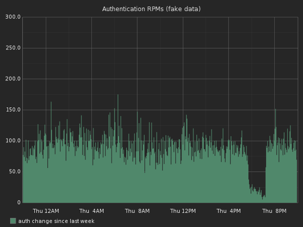
As percent
Another technique is to compare the percentage growth since last week. Let’s imagine we are looking at sales or signup numbers. We could graph today’s sales per minute vs those from last week.
To do that, Graphite has the asPercent function. This function
takes a series representing 100% and second to compare against.
The function call looks a bit scary so let me try to break it down over
multiple lines:
asPercent(
  summarize(sumSeries(stats.timers.accounts.*.http.post.accounts.response_time.count),"1min")
  ,timeShift(summarize(sumSeries(stats.timers.accounts.*.http.post.accounts.response_time.count), "1min"),"1w")
)
The first argument is the summarized RPMs (requests per minute) and the second is last week’s summarized RPMs.
Here is how the graph looks:
Based on all the data we collect, we can now graph something like that:
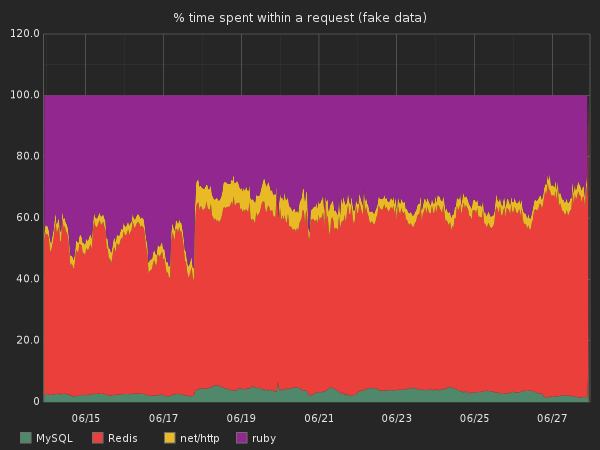
This graph is basically the same as the one above, but we used the overall response time as the 100% value and we graphed all the different monitored sections of our code base.
You can now build some really advanced tools that look at trends, check pre- and post-deployment measurements, trigger alerts, and help you refactor your code.
Maybe you suspect that your app has a chokepoint at the database level. You can track the query types and the targeted tables per API endpoint. You can see where you spend most of the time and which code path is responsible for it. You can quickly see if adding indicies or other database-level techniques actually make a difference.
Other tips
Share a url into campfire/irc and see a preview
Campfire and many other chat tools offer image preview as long as they detect that the url has an image extension. Unfortunately, Graphite’s graph urls look more like this:
https://graphite.awesome.graphs.com/render?width=400&from=-4hours&until=-&height=400&target=summarize(sumSeries(stats.timers.accounts.*.http.post.accounts.response_time.count))&drawNullAsZero=true&title=Example&_uniq=0.11944825737737119
To get a preview, just append the with: &.jpg
Get the graph data in JSON format
You might want to do something fancy with the data like
create alerts. For that you can ask Graphite for a json representation
of the data by adding &format=json to the URL.
[
 {"target":
  "summarize(sumSeries(stats.timers.accounts.*.http.post.accounts.response_time.count))",
  "datapoints": [
    [20260.0, 137256960],[19513, 1372357020] //[...]
   ]
  }
]
The data points are the timestamped value of each graphed point. Note that you can also ask for the CSV version of the data then pass it on to some poor bastard using Excel.
Only show top graphs
Let say that you are graphing the response time of all your APIs. The amount of displayed graphs can be overwhelming.
To limit the displayed graphs, use one of the filters. For instance the currentAbove or
averageAbove filters that can help you only display web services with
more than X RPMs for instance. Using filters can be very useful to find
outliers.
Get going with Graphite!
Hopefully this guide will help and inspire you to start using Graphite to easily collect and analyze your metrics. I’m sure there are great tricks I forgot to mention, please add your favorites in the comments.
Thanks to Jeff Casimir for reviewing this post before its publication!